Client: A Bay-Area based biopharmaceutical company, specializing in developing and commercializing treatments for rare genetic diseases. The company's success had lead to global expansion.
Problem: Due to the rapid growth of the company, it was important to define the employee experience. The client wanted employees to be educated and excited about company-provided benefits. We determined it was important to establish a framework, look and tone for future communications.
I gathered information about my client’s employee demographics, culture and attitudes. Additionally, we sourced employee reviews to get first-hand perspectives. We needed to highlight the benefits and avoid pain points for the employees.
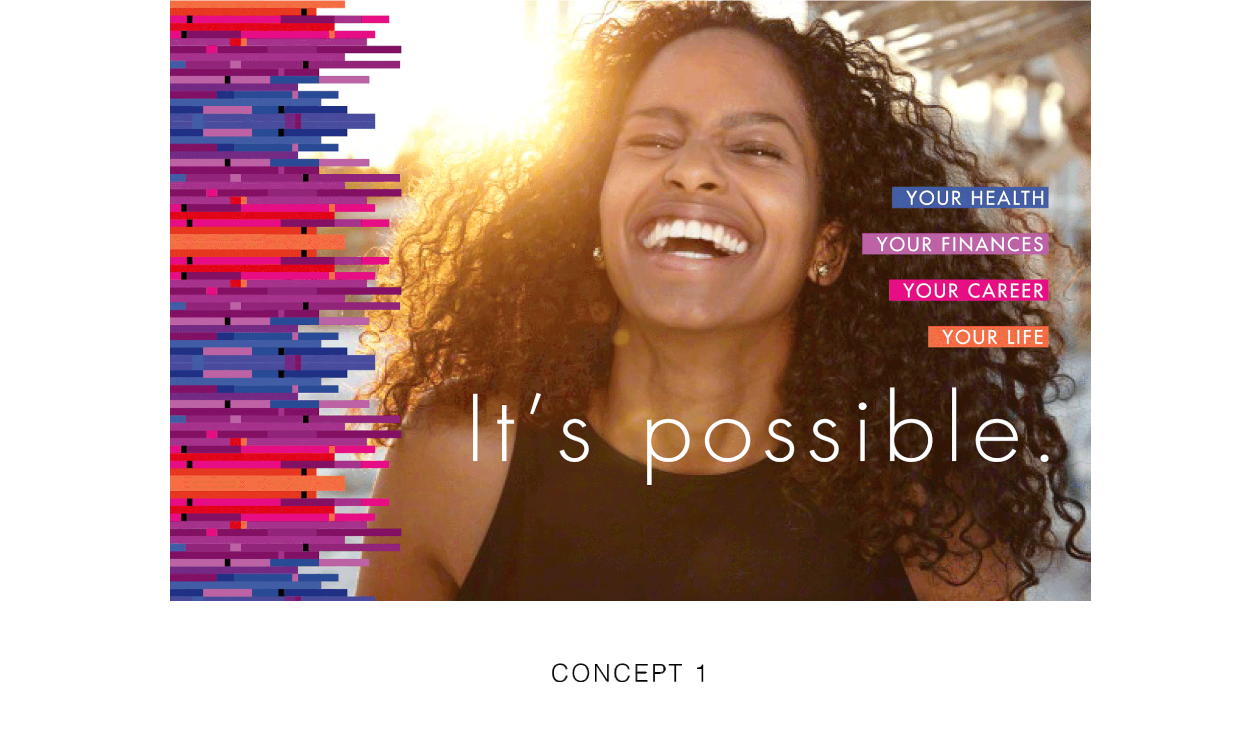
Three basic directions were pitched to see what spoke best to what the employee experience was and what they wanted it to be.
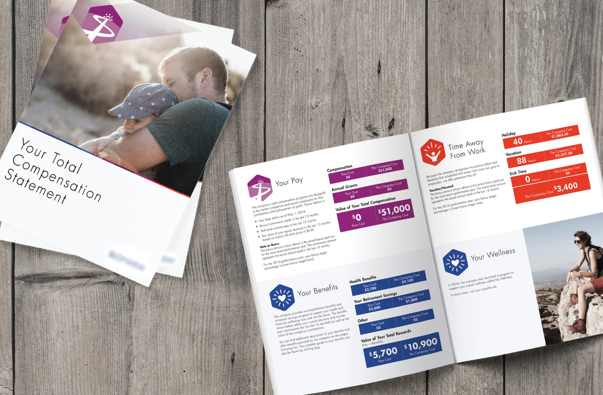
We created “buckets” to visually organize the benefits offered and iconography that stood out. Each color, icon and language would be carried through future communications, depending on topic.
“POWERED BY YOU” connected the company’s growth back to the employee and inspired a sense of confidence to employees, personally and in their careers.
We crafted supporting messaging and graphics to highlight the total value of benefits and images that spoke to both the employee demographics and office location.
Designing a look that complimented the client’s external brand, we were able to produce templates and guidelines for future use.
SENIOR LIVING NONPROFIT
Client: A west-coast network of retirement homes offering afforable housing solutions, with the mission of helping older adults live their best life.
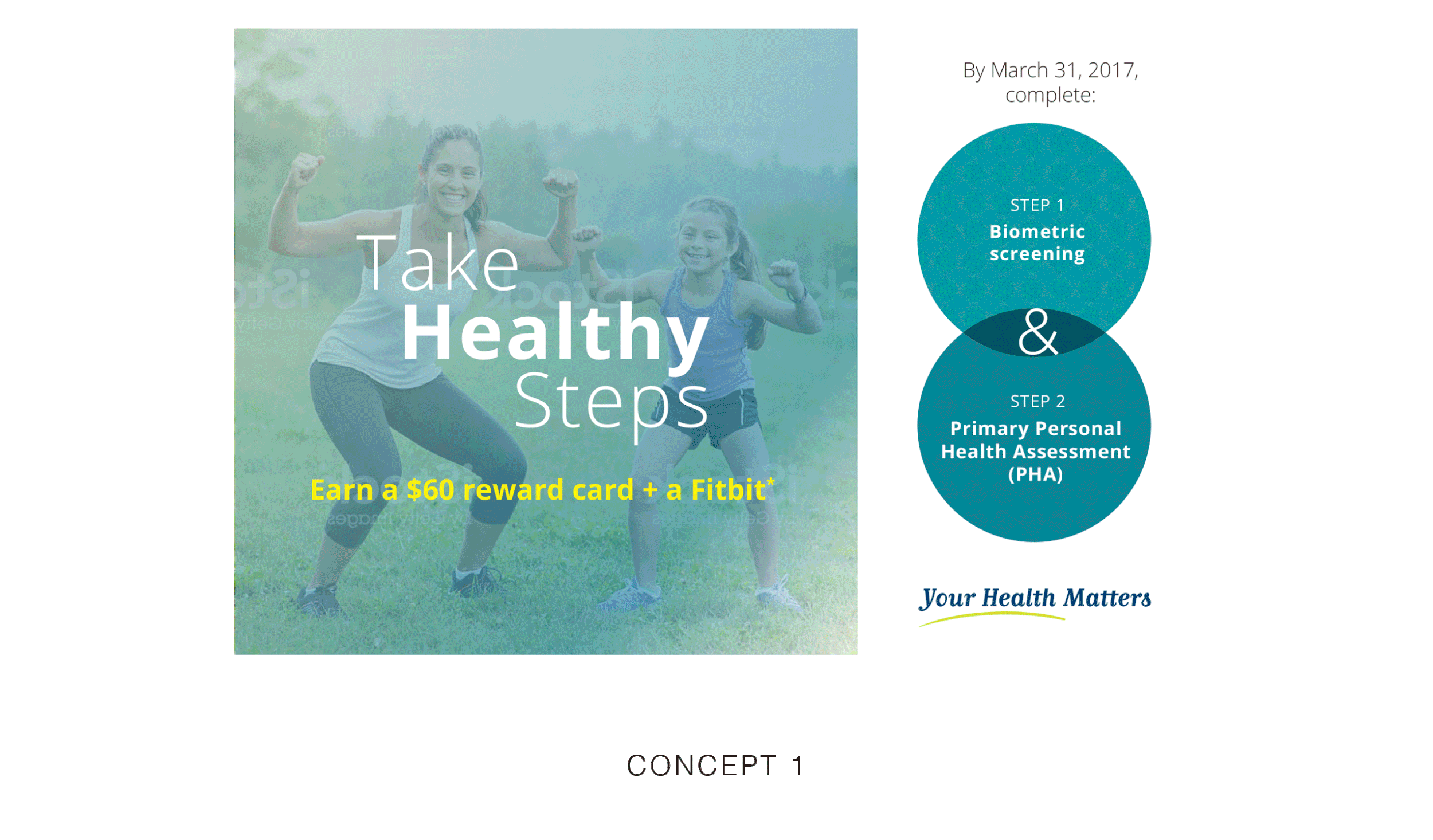
Problem: The client was launching a new wellness campaign, offering health-related challenges and prizes. Our main concern was that employees had not been paying attention or reviewing their benefits materials.
The client desired a more modern-look than their existing external branding, especially since their employee demographic was far younger than the seniors they worked with.
Three concepts were proposed and a promotional postcard for each concept was designed. Each concept offered a completely different look from their external brand.
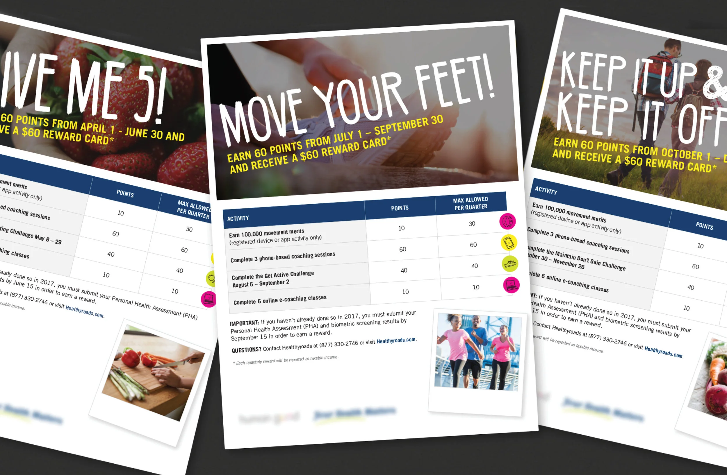
The final campaign featured bright neon illustrations overlaid on health-focused images. Handwritten fonts softened the look. The client felt this concept most connected with their workforce and was a welcomed departure from their previous unengaging communications.
Each quarter, a different health challenge was featured in the campaign. A new flyer, poster and postcard were distributed for each challenge.
DATA STORAGE AND HARDWARE BRAND
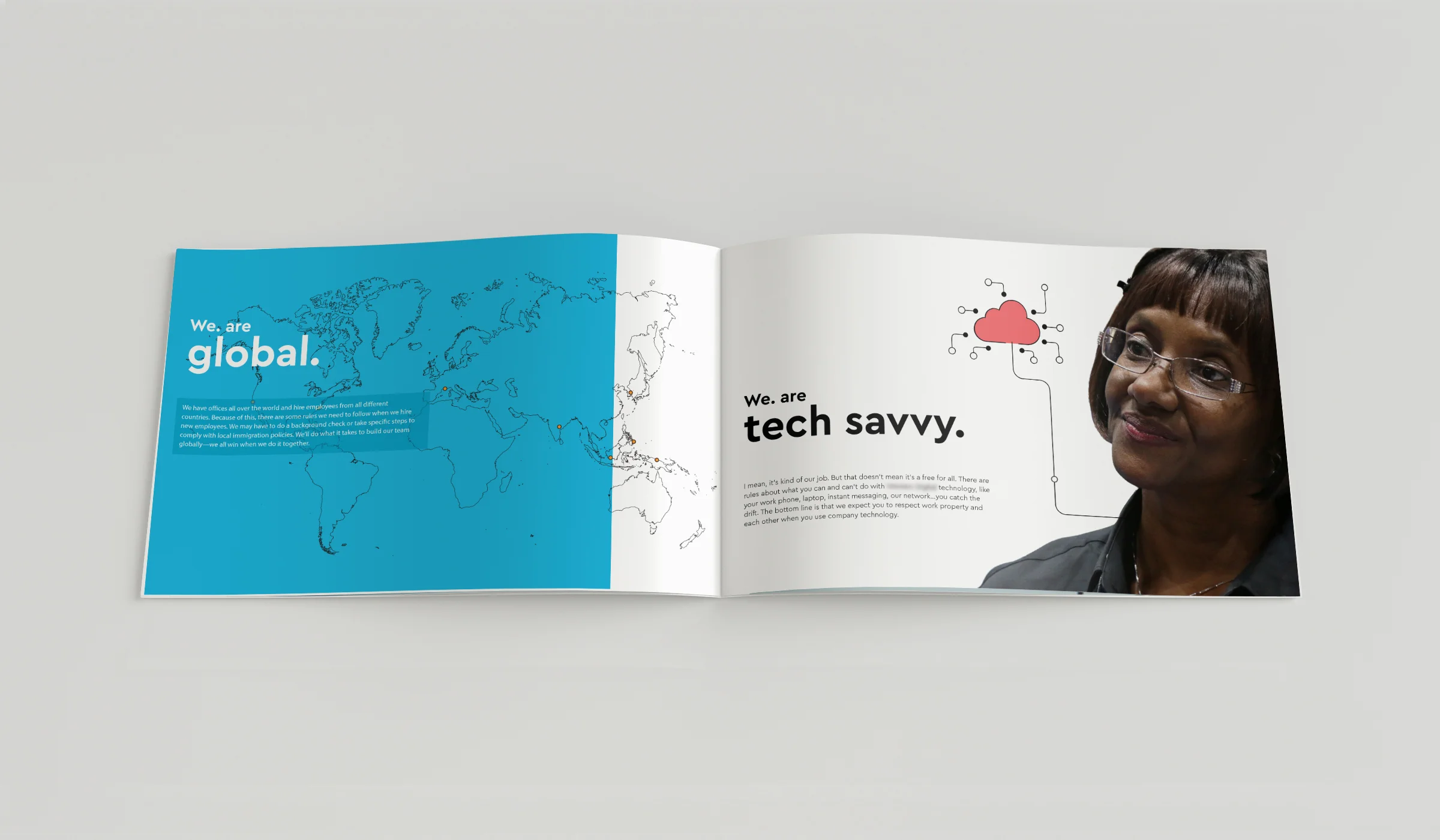
Client: A global data storage company with one of the largest computer hard disk drive manufacturing operations in the world.
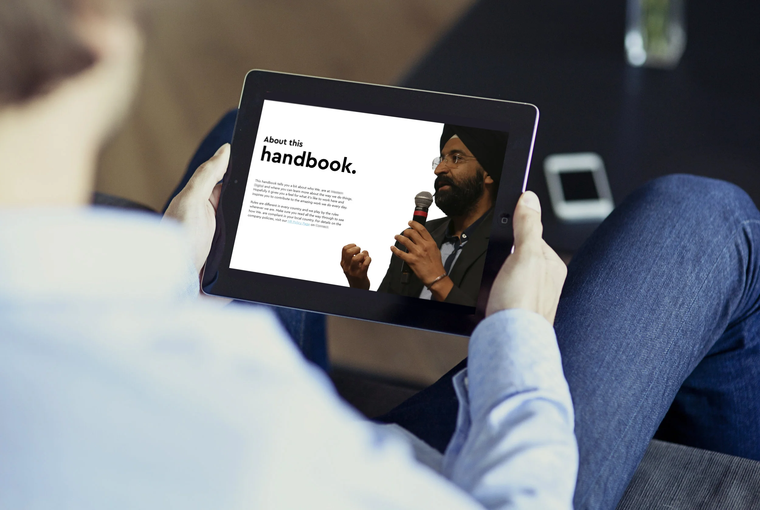
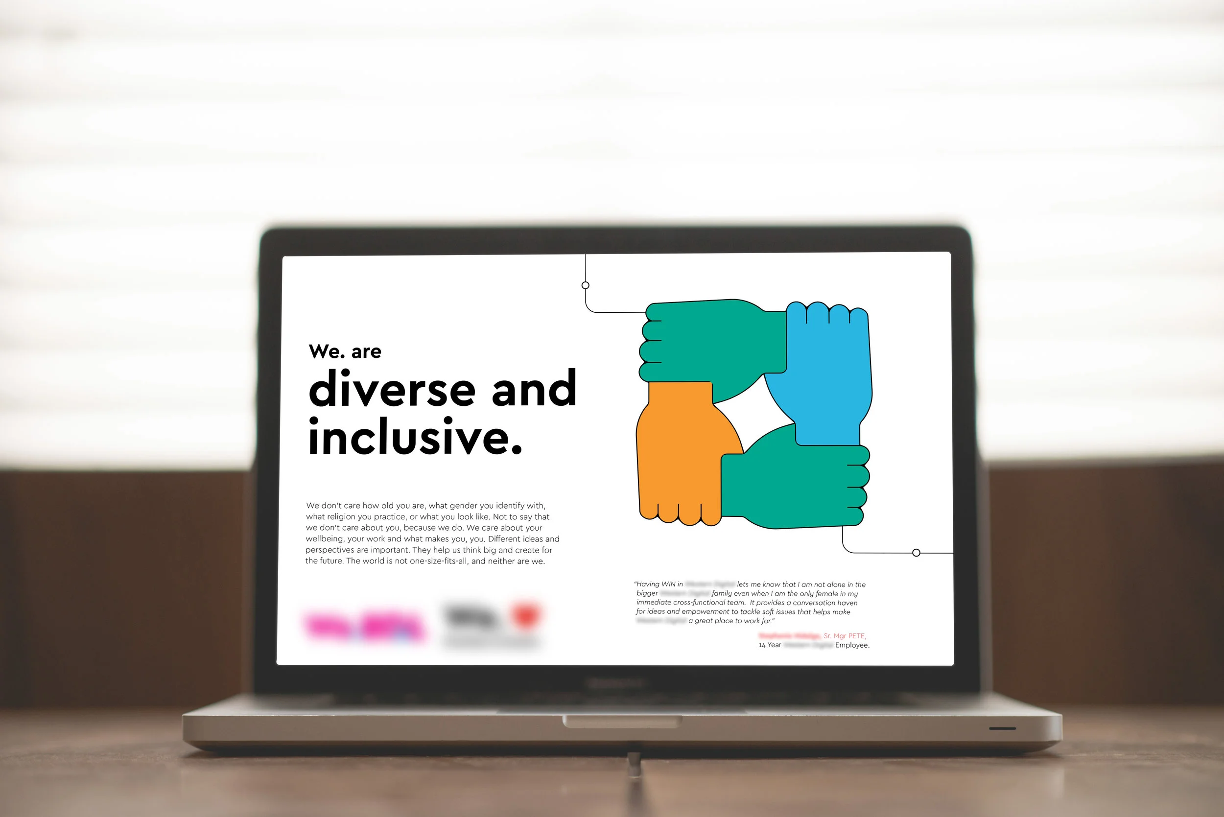
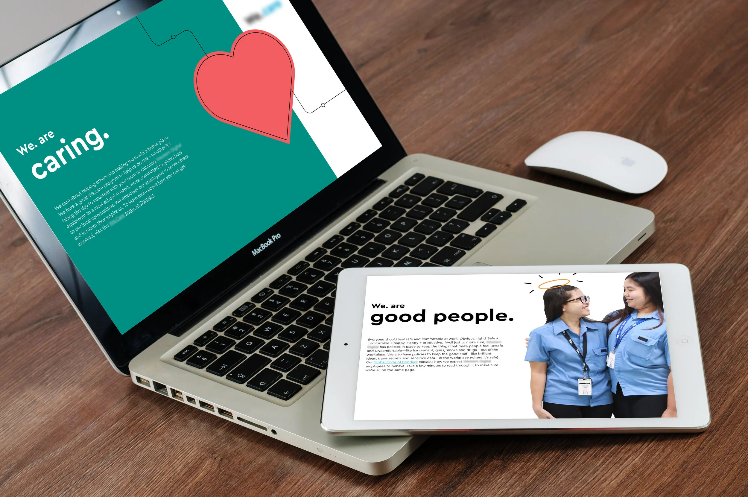
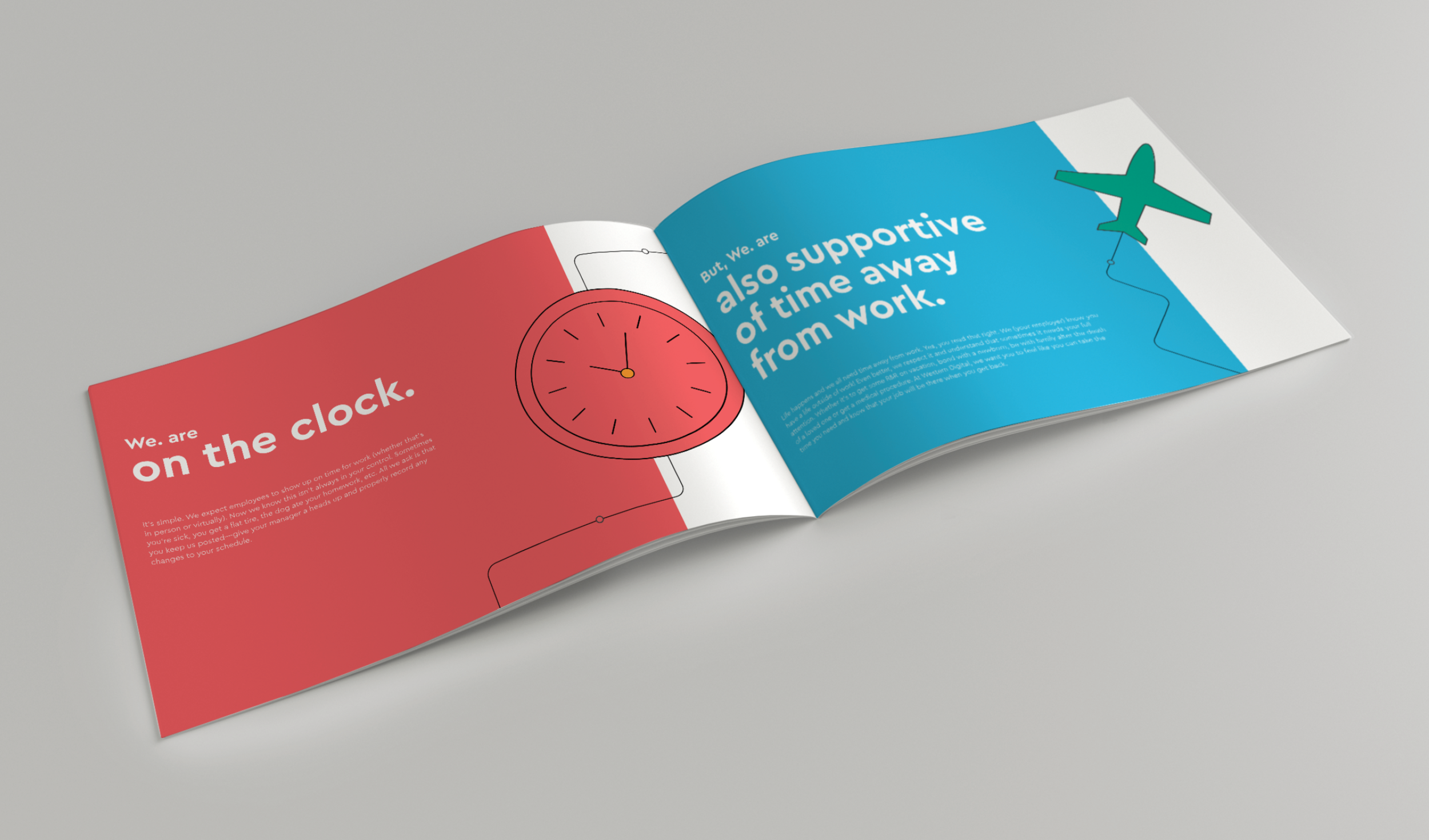
Problem: After acquiring a major competitor, the client was looking for a fun, inviting document that reflected the future of the brand. This guidebook needed to outline the rules, benefits and culture and to make sense across the subsidiaries and cultures of the global company.
We created an easy, welcoming read to get new employees excited to work.
Clean illustation using thin lines and internal branding colors were paired with high-quality employee photos.
The guidebook was designed to be distributed as both a PDF and a printed booklet, depending on office size and location.
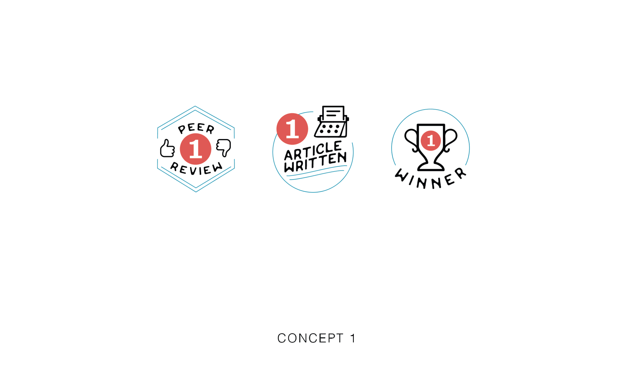
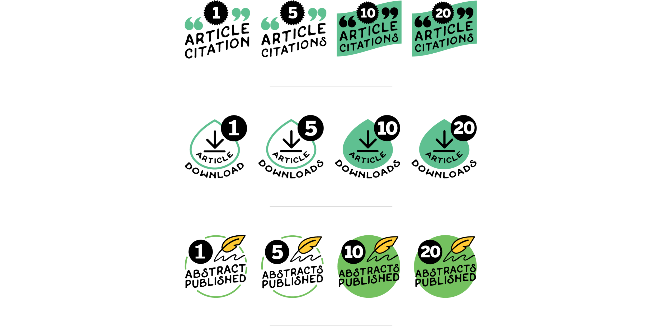
Client: Cureus is a free, open-source online medical journal with hopes to democratize and streamline the medical publishing process.
Problem: Cureus had great success in getting researchers to publish articles. However, Cureus wanted to reward members for taking more of an active role on the site and taking part in competitions.
Achievement badges were introduced to inspire action, drive commitment to the platform and encourage competition between researchers.
I presented four design concepts that would work with the design of the site.
The final achievement badge designs featured typography paired with applicable shapes and icons. Color usage delineated different achievement families, such as social (blue and orange) and competition (red) families.
A user that was active in the community in a specific way would have a lot of the same badge colors. Acquiring a badge of another achievement family be would be different color and might come as a suprise to the user.
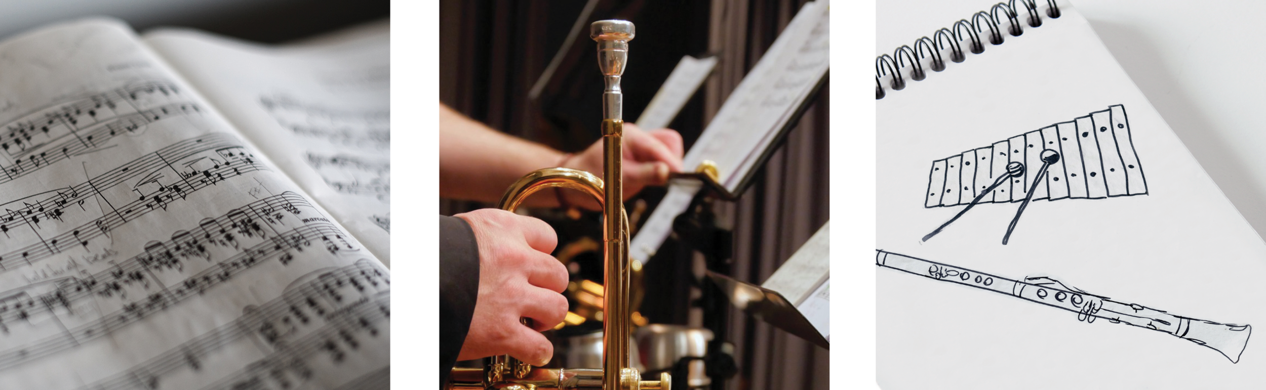
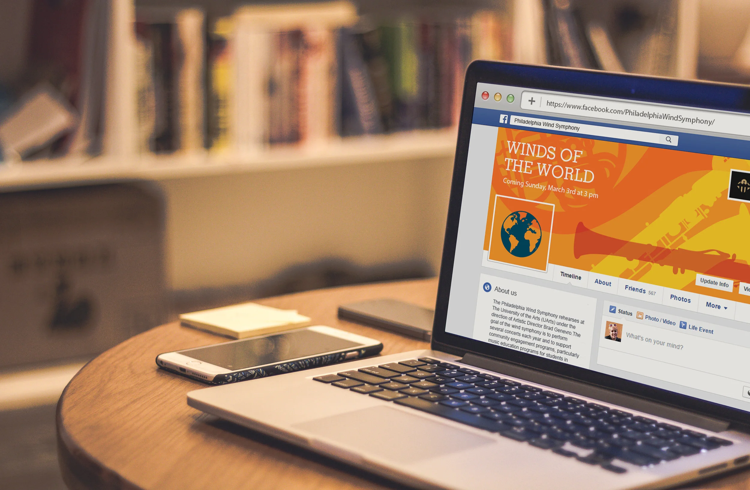
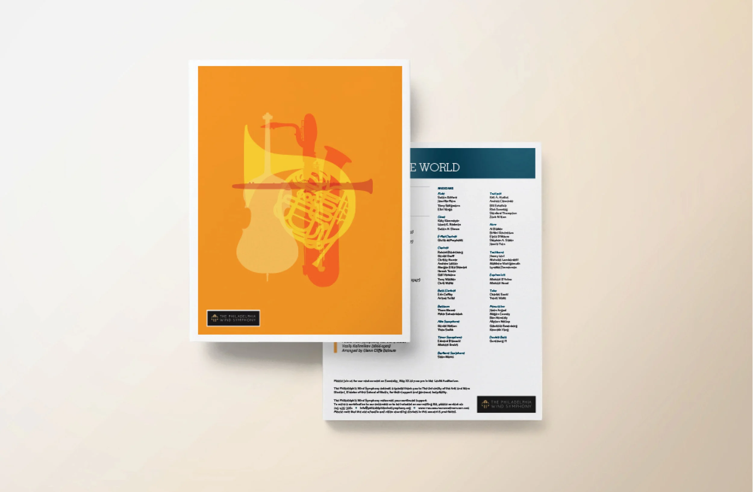
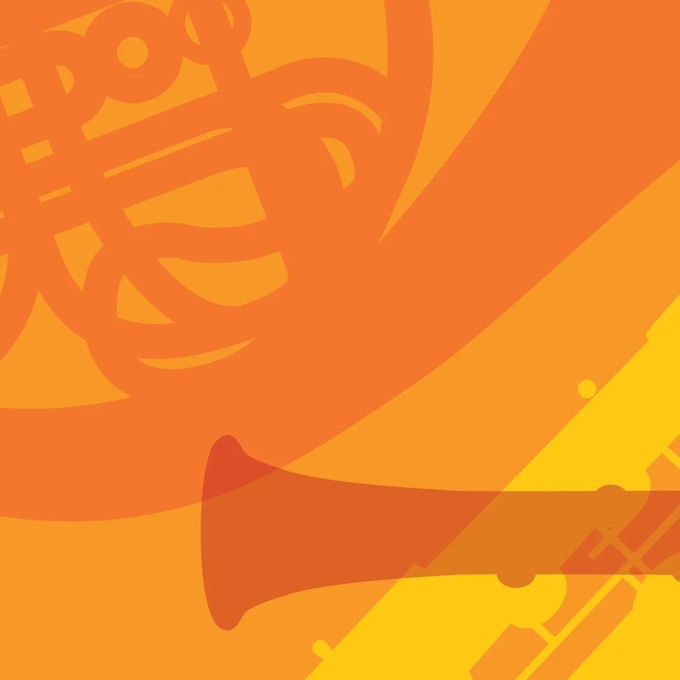
Client: The Philadelphia Wind Symphony is a non-profit volunteer ensemble of woodwind, brass and percussion players.
Problem: They needed eye-catching promotional materials for an upcoming performance. Themed “Winds of the World,” the performance showcased a lineup of famed international composers.
A saturated, monochromic overlay pattern of wind instruments was both engaging and set a style for future performance promotions.
Our strategy included a promotional poster and Facebook cover images to advertise the performance. The program echoed the promotional look.
HUMAN RESOURCES CONSULTING TOOL
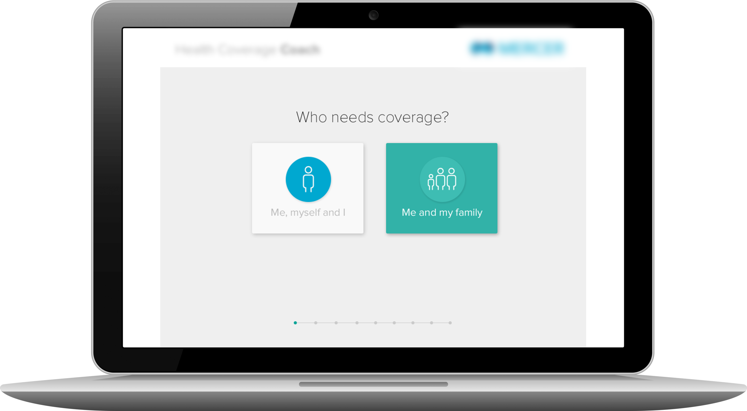
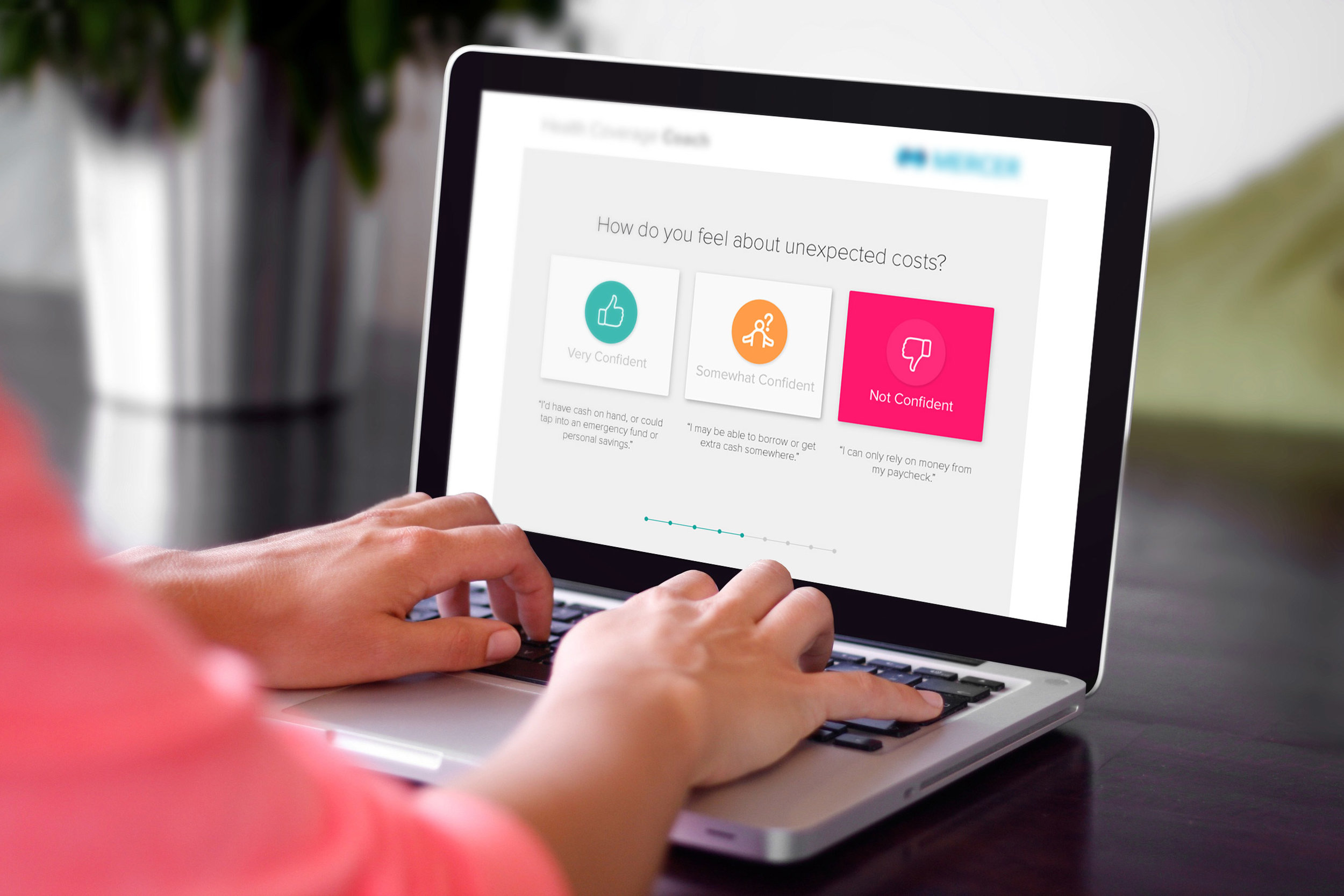
Challenge: We needed to update the user interface of a health care coverage decision tool. It needed a clean, modern feel that echoed other tools in the client product library.
This tool is meant to give you an idea of what amount of coverage is right for you. After answering a series of questions, you are given a healthcare buyer type. The tool then suggests applicable employer-sponsored plan options for you.
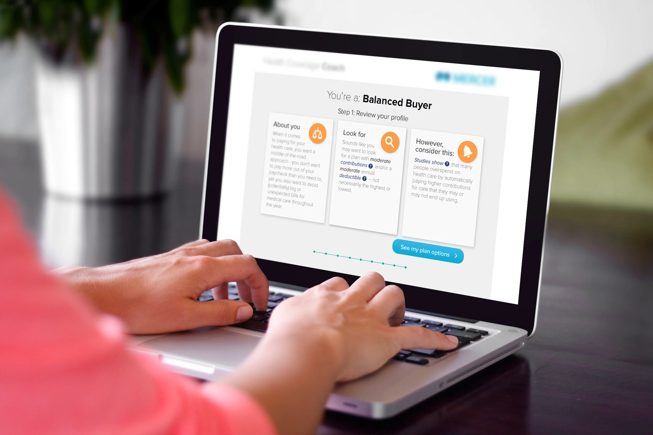
Colorful iconography helped to simplify decision making. Each option featured an annotative quotation beneath it to add context for users.
Certain steps of the tool needed some explanation and education. It was important to show this information, but make it easy to skip if desired.
Before the redesign, all of this information would appear on one page. It was important to keep the steps simple and clear, so educational pages were introduced.
Consistency and usability were paramount. We made sure to design a page counter at bottom for user orientation purposes.
At the end of the tool, the user is given a healthcare buyer type. The tool then suggests an employer-sponsored plan option that would work best for the user's healthcare needs.
COMBINING GAMIFICATION AND HR EDUCATION
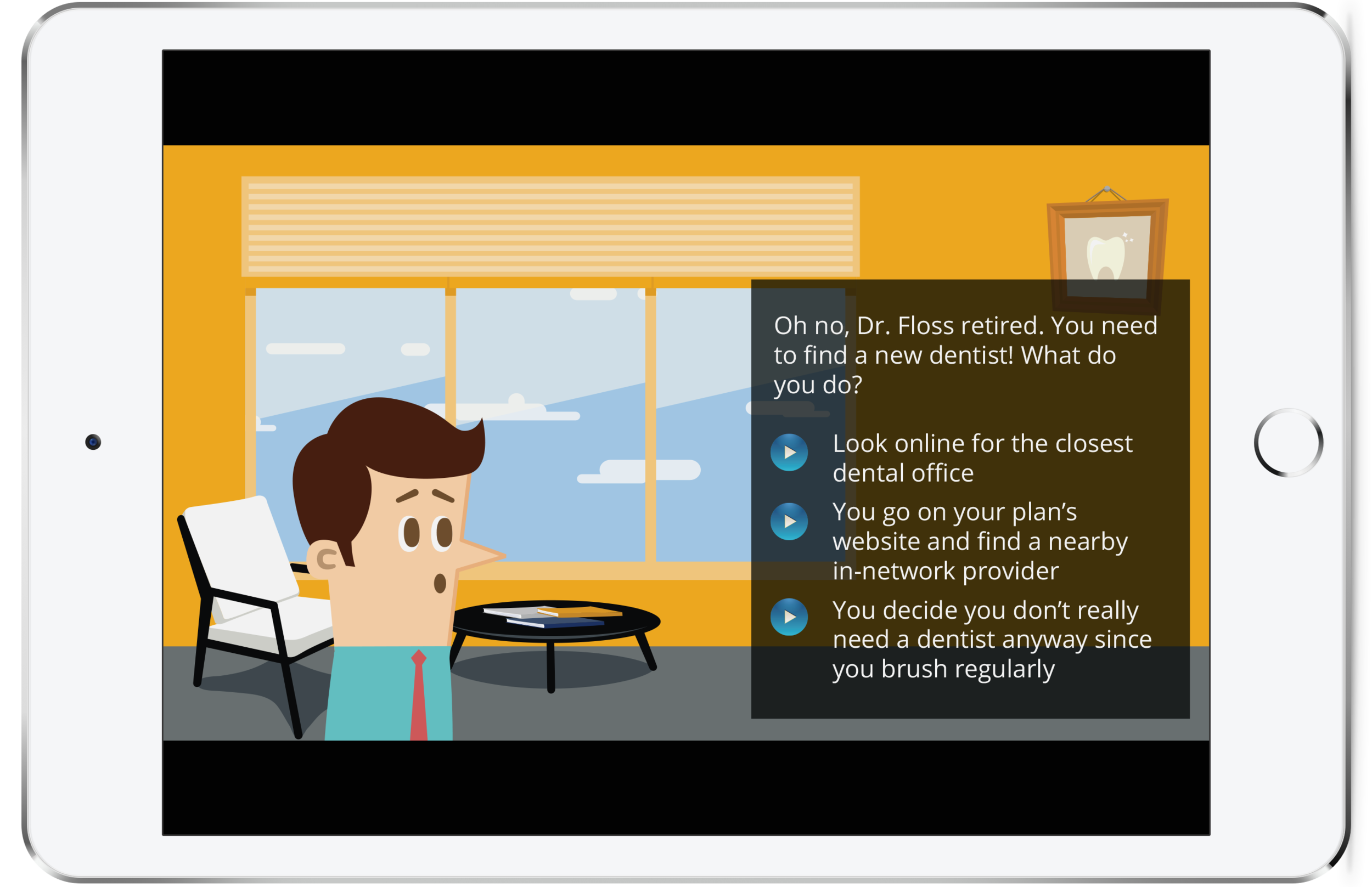
Challenge: We wanted to arm employees with knowledge to make better health, wellness and financial decisions. It has always been a challenge to make important human resources information both interesting and educational. We decided to create online games that would be available as add-ons to employee benefits websites. These games needed to be relatively simple due to programming restraints.
GAME CONCEPT 1
Who Will You Be?
This game shows the long-term impact of benefits-related choices. The user inputs demographic information and designs their avatar. They are then challenged with various life-changing scenarios and the user’s avatar responds to the decision, whether good or bad.
At the end of the game, your avatar has gone through the game of life and the game player gets a synopsis of their health and retirement.
GAME CONCEPT 2
Battle the Tax-Man!
This mini-game pits the player against the tax-man and educates the user about ways to save money by making smart tax-related decisions.
The money meter fills up as you make decisions that help the he user save money, but keeps money from the tax man. The tax man responds dramatically based on the user's responses.
GAME CONCEPT 3
Simulated Benefits City
This game challenges the user to make on the fly decisions about benefits-related life changes. The user is free to walk around a small town and enter different buildings. Each building features a different scenario.
As the player navigates around the city, they quickly learn how to tackle benefits-related problems. These scenarios can be tailored to the workforce and issues of a specific employee population.